BUS5VA Visual Analytics Case Study 2 Sample
Assignment Details
Case Study 1 - Bank Marketing Campaign for Intelligent Targeting
In this case study, envision yourself as a junior business analyst collaborating with the marketing team to analyse and determine the best campaign strategy for a bank aimed at attracting customers to open term deposits. Successful marketing campaigns are characterised by their focus on customer needs and overall satisfaction.
However, several variables play a pivotal role in determining the success of a marketing campaign. We must carefully consider the following variables when crafting a marketing campaign:
- Customer Segmentation: Identify the target population segment and justify your choice. This aspect is very important as it suggests which segment of the population is most likely to respond to the marketing campaign's message.
- Distribution Channels: Devise the most effective strategy for reaching customers. It is important to define the target population segment to address and select appropriate communication channels, such as telephones, TV, and social media, for disseminating the campaign's message.
- Pricing Strategy: Determine the optimal pricing strategy for potential clients. Note that in the context of the bank's marketing campaign, pricing may not be the primary concern, as the bank's primary objective is to encourage clients to open deposit accounts to support its operational activities.
- Promotional Strategy: Outline the strategy's execution and how potential clients will be engaged. This step should follow an in-depth analysis of past campaigns (if available) to gain insights from past mistakes and enhance the overall effectiveness of the marketing campaign.
Your task as a junior business analyst is to address the following questions from the marketing team by creating visualisations in Tableau:
Task 1.1 (5 Marks): Investigate whether there is a significant age distribution difference between clients who make a deposit and those who do not.
Task 1.2 (5 Marks): Analyse whether a client's job or career has an impact on their likelihood to make a deposit.
Task 1.3 (5 Marks): Explore how the duration of the last contact influences the campaign's success (i.e., the likelihood to make a deposit).
Task 1.4 (5 Marks): Identify at least four campaign strategies, such as who should be contacted, how to contact them, and when to contact them. Present your findings in the form of a dashboard in Tableau.
Case Study 2 - Sports Analytics for Informed Decision Making
In this case study, you will take on the role of an analyst consultant working closely with the manager of a soccer team. Your objective is to explore the Soccer Match Dataset (available on LMS) and help the team manager to make informed decisions. The Soccer Match Dataset is a comprehensive collection of spatio-temporal events that occur during an entire season of seven soccer competitions, including La Liga, Serie A, Bundesliga, Premier League, Ligue
1, FIFA World Cup 2018, and UEFA Euro Cup 2016. This dataset offers valuable insights into various aspects of soccer matches, such as passes, shots, fouls, and more, and contains information about position, time, outcome, player, and other characteristics. Your task is to conduct descriptive analytics on this dataset and create interactive Tableau visualisations to empower the team manager with insights into the datasets, enabling informed decision-making.
Task 2.1 (5 Marks): The manager is searching for a skilled goalkeeper to join the team. Generate visualisations ranking goalkeepers based on the number of save attempts they made and highlight the top 5 goalkeepers with the most save attempts. Your visualisations should enable users to access player attributes, including weight, height, full name, and nationality, by hovering over the players of interest.
Task 2.2 (5 Marks): Lionel Messi (wyId: 3359) and Cristiano Ronaldo (wyId: 3322) are two of the greatest soccer players. Compare the game performance (e.g., the number of shots and number of passes) and physical characteristics (e.g., height, weight, and dominant foot) of Lionel Messi and Cristiano Ronaldo, to aid the manager in deciding between the two legendary players for potential recruitment.
Task 2.3 (5 Marks): The manager is interested in the potential impact of players' physical characteristics on their game performance. Create visualisations to investigate the correlations between players' physical characteristics (e.g., height, weight, and dominant foot) and their game performance (e.g., the number of passes, number of shots, and number of free kick).
Task 2.4 (5 Marks): Develop a Tableau dashboard to be used by the manager for future reference. Your dashboard should enable the manager to (1) rank players based on a selected event type (focusing on Pass, Shot, Free Kick, Foul, Offside) and (2) compare game statistics between the first half (1H) and second half (2H) of matches, based on a selected event type (Pass, Shot, Free Kick, Foul, Offside).
Solution
Introduction
In today’s age of big data understanding and presenting data in an iterative manner is of essence is the ability that defines many analyses. Tableau is one of the most popular tools used for data visualization and it helps users to analyze data and create interactive visualizations for business intelligence. This report explores the application of Tableau in two distinct case studies: an advert produced by a bank that is in a marketing campaign that focuses on efficient promotions and sports statistical analysis focusing on soccer teams. Analyzing Tableau’s tools, the report shows that such visualizations enable discovering hidden patterns and characteristics, improve marketing and player performance strategies. Hypothesis targeting the age bracket of clients to be targeted based on job, impact of job to deposit like likelihood, goalkeeper performance analytic, and comparing icons soccer players will showcase how Tableau transforms data into insights. This exploration therefore emphasizes the centrality of data visualization in enabling strategic management and organizational performance.
Case 1: Bank Marketing Campaign for Intelligent Targeting
Task 1.1: Investigate Whether There Is a Significant Age Distribution Difference Between Clients
The first task sought to identify whether there is a skewed age difference between the clients who open the term deposit and those who did not (Mazlan, Sainan and Mohamed, 2023). To do this, a histogram with ages as the x-axis and frequency as the y-axis was made possible using Tableau with the option to segment results based on deposit status.
The findings of the Visualization indicated that the clients who are using term deposit were older than the other group who were not using the term deposit (Dewi, Nilawati. and Anandita, 2024). This was evident from the distribution where the age group of depositors ended up being dominated by older people (Park and Park, 2021). There is an apparent indication that trying to reach out to older clients might help in enhancing the probability of realizing future marketing initiatives. Additional quantization could entail splitting age into particular categories to capture niche markets more accurately.
.png)
Figure 1: Part of Significant age distribution difference between clients
(Source: Implemented by Tableau)
The shared visualization concerns a line graph that focuses on the distribution of clients by their age. The x axis is the age of the clients starting from 15 up to 95 while the y axis is the number of clients in that age group. The peak has arisen in the age group of 25-35, wherein the values are gradually decreasing with the increase in age for the assignment helpline.
Task 1.2: Analyse Whether a Client's Job or Career Has an Impact on Their Likelihood to Make a Deposit
To illustrate the correlation between job type and the propensity to make a deposit as observed from the client data, a bar chart was developed using Tableau as shown in Table 5. This chart made the degree of differentiation among job types and deposit rates comprehensible, as the number of deposit comparison has been established above. As the bar chart showed there were certain professions where higher deposit rates were found especially the management and technical jobs.
.png)
Figure 2: Bar Chart of Job Type on Deposit Likelihood
(Source: Implemented by Tableau)
This insight will be useful for the marketing team in the bank to know which job categories are likely to embrace deposit campaigns. They provide an avenue of targeting specific job categories eliminating the generality of marketing messages thus enhancing the prospects of achievement of campaign goals.
Task 1.3: Explore How the Duration of the Last Contact Influences the Campaign's Success
For this work, this visualization was created in Tableau, to analyze the connection between the length of the last interaction with the effectiveness of the campaign (Dent et al. 2021). The graph depicted contact duration on the amount of loan deposit with each dot or node referring to a particular client.
.png)
Figure 3: Visualization of the Duration of the Last Contact Influences the Campaign's Success
(Source: Implemented by Tableau)
The plot also unmasks an increasing trend of deposit rates with longer contact durations. This means that if the interaction with the clients is taken further, the likelihood of getting a deposit would be improved. This plot established this correlation further, to stress the necessity of extemporaneous communication at potential clients. From this insight, the marketing team may be in a position to modify its contact strategies with the view of enhancing the general impact of the campaigns.
Task 1.4: Dashboard Creation
The last activity entailed creating a dashboard in table of the results of the preceding tasks. Additionally, the dashboard included components that let users navigate to the content by applying various filters.
To synthesize, the dashboard united several components to offer an overall opinion about the marketing campaign. Firstly, it included the Age Distribution visualization that displayed the distribution of the number of clients by their ages and their deposit/ no deposit status. This element enabled the users to recognize relationships in the age segment with higher deposit ratio. Secondly, the Job Type Analysis component used a bar chart to show how likely a deposit was going to be made based on job type. This made it easy to identify which professions were more receptive to the marketing campaign hence helping in propagation efforts.
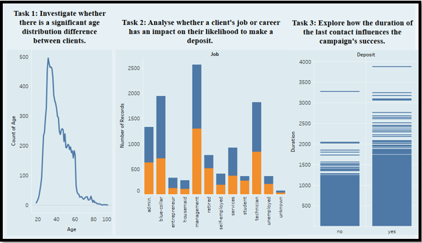
Figure 4: Dashboard Creation Part
(Source: Implemented by Tableau)
Finally, there was the Contact Duration Analysis which depicted the campaign success based on the duration of contact with the clients. This component helped to understand the positive effects of longer contact with clients by illustrating how deposit rates depended on contact duration. Altogether, such elements allowed considering various aspects of deposit behavior and identifying factors affecting them more carefully. Dynamic data visualization and its interactivity proved beneficial in gaining a broader perspective of how the campaign was performing and contributed to the fine-tuning of marketing efforts.
Case 2: Sports Analytics for Informed Decision Making
Task 2.1: Rank Goalkeepers Based on Save Attempts
This task aimed at defining and sorting a list of goalkeepers according to the number of save attempts. To compare the goalkeepers by the number of save attempts, a bar chart was created in Tableau with emphasis on the best performers.
The bar chart was very effective in displaying the save attempts for the five top goalkeepers, complete with tooltips that displayed the weight, height, full name, and nationality of each player.
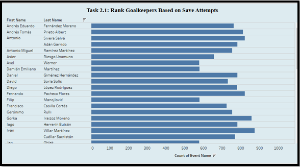
Figure 5: The part of Identifying Goalkeepers based on Save Attempts
(Source: Implemented by Tableau)
On this account, this visualization is essential particularly for the team manager where they get to judge potential goalkeepers on their performance from a clear, comparative vantage. Because there is more information regarding hover one can make a better decision when selecting it.
Task 2.2: Compare Lionel Messi and Cristiano Ronaldo
To analyses the performance of the game and the body measurements between Lionel Messi and Cristiano Ronaldo, the following visualizations were developed (Stephens and Young, 2020). Two bar charts were used to track down their shots and passes and, on the other hand, a table contained the players physical characteristics like height, weight, and preferred foot.
.png)
Figure 6: Comparison Between Messi and Ronaldo using Bar Chart
(Source: Implemented by Tableau)
The bar charts above revealed that Cristiano Ronaldo made more shots than Messi did while Messi completed more passes. The table that was provided to me showed how they differ in height, weight and the preferred foot they use. This detailed comparison is beneficial for the manager to make the right decision about recruitment since it presents a clear view of every player’s qualities.
Task 2.3: Investigate Physical Characteristics and Game Performance
This task was to assess the correlation between the players physical properties and the performance on the game (Torres-Ronda and Curtis, 2022). In the context of data exploration affordances, charts was developed in Tableau to establish relationship patterns between height, weight and the side of the foot depending on various performance statistics including, the passes, the shots and the free kicks.
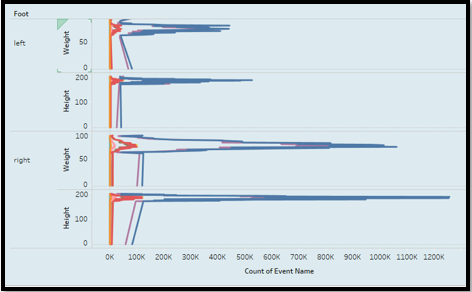
Figure 7: Visualization Part of Investigate Physical Characteristics and Game Performances
(Source: Implemented by Tableau)
The plots revealed that defensive effectiveness increased positively with height while weight was also positively and moderately associated with the number of shots attempted by the players. This information is crucial in analyzing how specific physical characteristics can somehow affect one’s performance on the game, and thus in assessment of players. For example, it will enable the team to know which player would be best suited for which role given his or her physical attributes of the team.
Task 2.4: Dashboard Creation
The last activity involved creating a detailed and all-encompassing dashboard that would help the manager in the assessment of players’ and match data. Some of the features were amusing and these included Player Ranking in which rankings for different event types were depicted and Half-Time Comparison in which comparison of game statistics between the first and the second half for selected event was depicted.
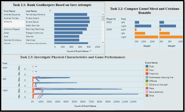
Figure 8: Dashboard Creation Part
(Source: Implemented by Tableau)
Some smaller elements like drop down menus and filter functionalities enabled the manager to select different event types and view statistics side-by-side. Thus, this dashboard can be used as a vital means that helps to control player performance and match characteristics for making better decisions.
Conclusion
The examples outlined above show how it is possible to use Tableau to analyze various sets of data and come up with useful information from the large chunks of information. In the case of bank marketing campaign, Tableau analysis pointed out important insights with regards to age, job type and contact duration which were rather helpful for fine tuning the existing and future marketing campaigns. In the sports analytics case, Tableau offered a clear comparison analysis between goalkeepers and famous players, and impact of physical attributes on the gamers. The use of interactive dashboards in both cases improved option for data and decisions Accent of the data and mechanics for the decisions. In general, Tableau has been of great help in transforming data into insights particularly in marketing and in managing sporting events.
References
.png)
- MCR004A Accounting System and Process Assignment
- TECH1100 Professional Practice and Communication Report 1
- Principles of Data Protection Act Assignment
- LAW3700 International Trade Law Assignment
- MIS610 Advanced Professional Practice
- MGT607 Innovation Creativity Entrepreneurship Assignment
- BE284 Strategic Management Assignment
- DEME20002 Supporting And Caring For People With Dementia
- Marketing Assessment Situation Analysis
- MBIS4008 Business Process Management Report 2B
- INFS5023 Information Systems for Business Assignment 2
- CAM528 Introduction To Epidemiology Assignment
- PUBH6012 Applied Research Project in Public
- ACCG8048 Business and Professional Ethics Assignment
- MAA705 Corporate Auditing Assignment
- External Auditing Process and Its Stages Assignment
- PRJM6010 Project and People Assignment 2
- ECE220 Science and Environmental Awareness for Young Children Assignment
- Project Audit and Quality Assessment Models Assignment
- PBHL20008 Engaging with Cross Cultural Communities Assignment

.png)
~5.png)
.png)
~1.png)


.png)